Death notices tell a different Covid story
Is this a sign of corruption at the highest levels?
Members of HART were struck by this analysis from Dr Simon and have published it here with his permission.
The data from death notices gives a second approach to mortality statistics. Whereas in the past collating such data showed a good correlation with official mortality data this was lost since 2020.
NEW ZEALAND
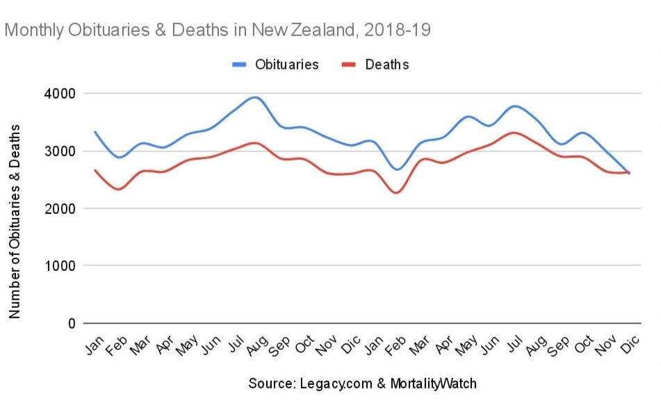
It is a very common practice to write a death notice in New Zealand after a loved one has passed away. This practice is so common in New Zealand that frequently more death notices get published through Legacy.com than the number of deceased, as some people publish more than one death notice for the family member that passed away.
Death notices are published usually within a week of the date of deaths and the mortality data is based on registration date, despite this, they correlate very well. Monthly death notices follow monthly deaths, and in NZ this is very evident.
Mortality and death notices in New Zealand follow a very clear seasonal pattern peaking in winter and falling in summer. Every peak and every trough in the death notices rate generally had a corresponding peak or trough in mortality rate prior to the pandemia.
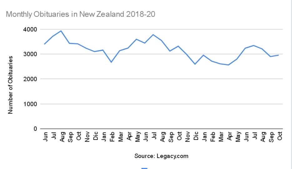
This pattern changed in 2020. Death notices followed the usual cyclical pattern with a gradual long term falling trend.
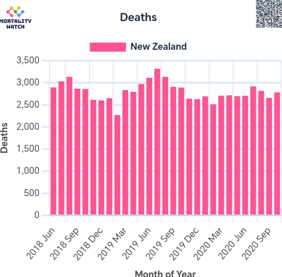
However the seasonal death pattern didn't occur in 2020. Deaths hardly rose as they always did in winter.
In 2020, one can see the hump in death notices from May to September , but can't see a corresponding hump in deaths. This suggests deaths were underreported during this period. Coincidentally this period corresponds to a time when lockdowns and other isolation policies were implemented in New Zealand.
A chart of the monthly death notices to deaths ratio clearly shows a sudden rise in June ‘20. Why would monthly death notices rise unless monthly deaths had risen as well? The fact deaths didn't rise is disconcerting and suggests authorities were hiding deaths to justify their stringent and unpopular policies.
If authorities alter official mortality data in New Zealand, one has to suspect mortality data could have been manipulated in other nations as well.
UNITED STATES
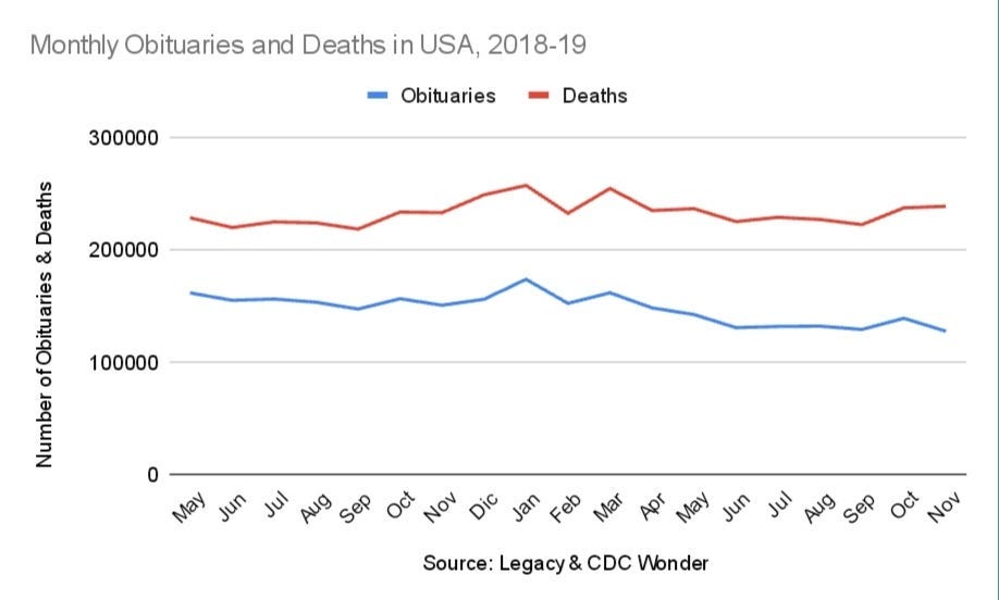
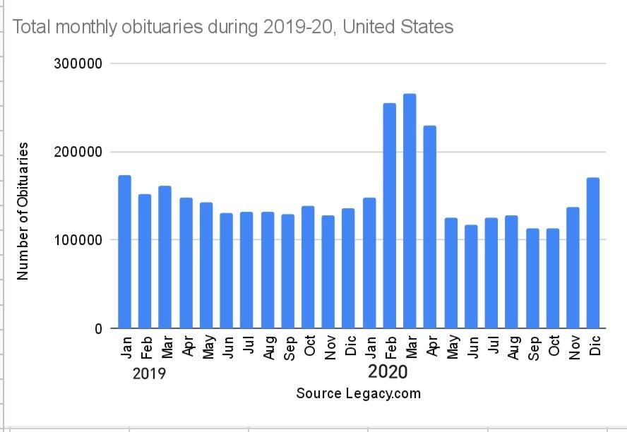
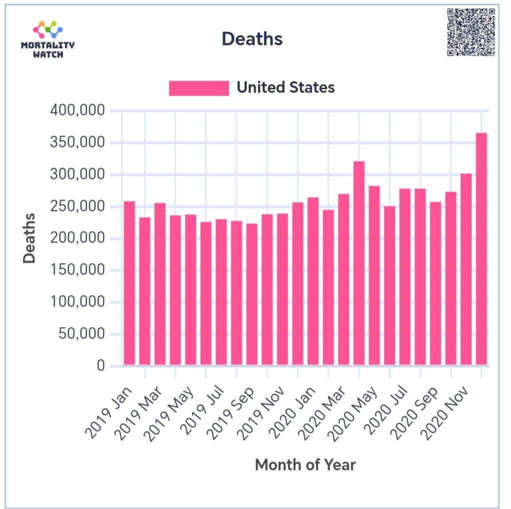
Death notices are not as common in the US as they are in New Zealand, however the number of monthly death notices and deaths follow very similar trends prior to pandemia, as expected.
In Feb’20 there was a sudden increase in published death notices. This trend continued for a period of three months, dropping back to baseline in May'20.
This sudden and clear increase in nationally published death notices suggest a sudden and corresponding increase in death in the United States during Feb, Mar & Apr of 2020. However, official mortality only rose in Apr’20 and only in some states.
Texas mortality, for instance, shows no signs of increased deaths, even though death notices in Texas did rise significantly.
The increase in Texas published death notices during the first quarter of ‘20 is jaw dropping and has passed unmentioned until now.
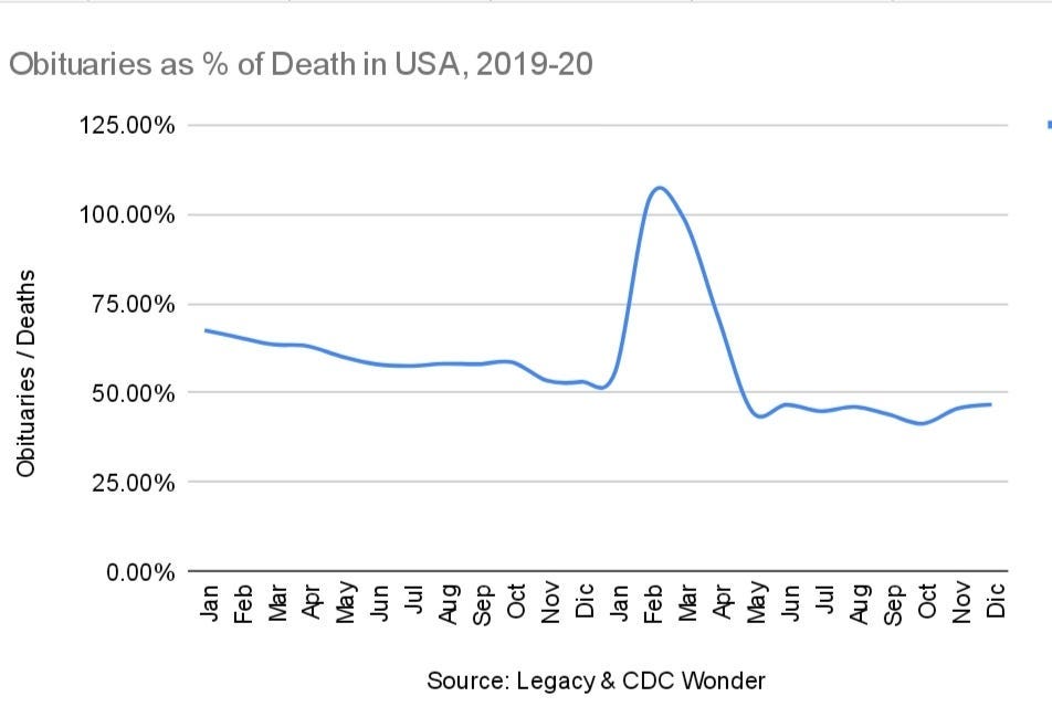
The ratio of US death notices to deaths clearly rose from Feb-Apr’20. This increase suggests tens of thousands of deaths were under reported prior to the official beginning of the pandemia. The ratio dropped somewhat in May’20 which suggests some overreporting as well.
We were told that only New York and vicinities suffered high casualties in spring ‘20. Death notices, however, tell a radically different story. Excess deaths happened in all states since Feb’20. Authorities not only hid the situation from the public but some took advantage of it to pursue personal economic interests.
ENGLAND
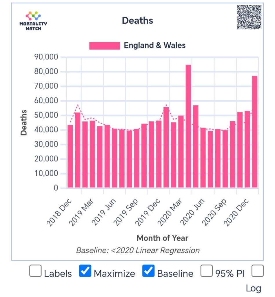
England death notices show a remarkable winter high for January 2020 with only a small uptick in April, unlike the official data. The huge surge in January 2021 according to official data is also missing from the death notice data.
OTHER NATIONS
A similar analysis of death notices was done in Canada and Scotland. All show a divergent patterns between death notice rates and mortality rates after pandemia began, not before, which suggests mortality data manipulation in all nations. If true it suggests a conspiracy at global scale.






Very strange. I can't think of a reason why this would occur - especially in several countries simultaneously unless there was some underlying conspiracy. Has anyone looked at the pattern for 2021, 2022 and 2023?
Why am I not in the least bit surprised? Oh yes, there is now a 99.9% chance your government is lying to you.